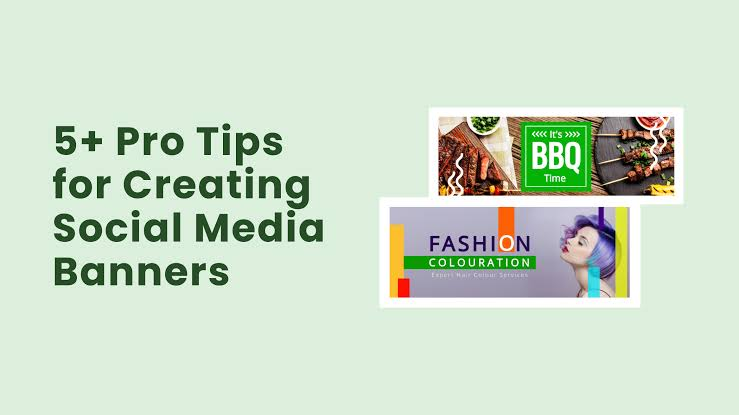
A good banner does more than fill an empty space. It helps introduce a topic, highlight an offer, guide visitors, and make your content easier to recognize. Whether you’re writing a blog post, updating a website, or preparing a social media campaign, simple and consistent visuals can make your content look more polished. For busy creators and marketers, time savings by using an banner maker can also make it easier to qaproduce quality visuals without starting every design from scratch.
You don’t need to be a professional designer to create an effective banner. Modern design tools provide templates, preset dimensions, editable layouts, and other features that simplify the process. The key is knowing what your banner needs to communicate and keeping the design focused.
This matters because visual content plays a major role in digital communication. Adobe reports that 58% of entrepreneurs and content creators create their own branding and visuals, while 71% use AI tools to help create visuals, brand assets, or posts.
Start With One Clear Purpose
Before choosing colors, images, or fonts, decide what the banner needs to accomplish.
For example, a blog banner might introduce the subject of an article. A website banner could promote a product or service, while a social media graphic might announce an event or encourage people to click a link.
Try to answer one simple question:
What should someone understand after looking at this banner for a few seconds?
Once you know the answer, remove anything that doesn’t support that message.
Keep the Design Easy to Scan
People rarely study digital banners for a long time. Your main message should be visible immediately.
A simple visual hierarchy can include:
- A short headline
- One supporting detail
- A relevant image or graphic
- Your logo or brand name
- A clear call to action when necessary
Adobe’s banner design guidance recommends establishing the hierarchy and CTA structure before focusing heavily on decorative styling.
Avoid filling every available space. Empty space can make the important elements easier to notice.
Choose Images That Support the Message
Your imagery should have a reason to be there. A beautiful photo that has nothing to do with the subject can make the design feel disconnected.
For a travel blog, use an image that immediately suggests the destination. For a technology article, consider screenshots, devices, interfaces, or relevant abstract graphics. For a promotion, make the product or offer the visual focus.
If the background is busy, add enough contrast between the image and text so the headline remains readable.
Use Consistent Brand Elements
Consistency helps people recognize your content across different platforms.
Choose a small set of brand colors and fonts and use them repeatedly. Keep logo placement reasonably consistent, and try to maintain a similar visual style across blog headers, website banners, and social posts.
This doesn’t mean every design needs to look identical. Instead, create recognizable visual rules that can be adapted to different formats.
Design for the Platform
A banner created for a website may not work perfectly as a social media graphic.
Different platforms and placements have different dimensions, cropping behavior, and viewing environments. A design that looks great on a desktop screen might become difficult to read on a phone.
Before publishing, check:
- How the banner looks on mobile
- Whether important text gets cropped
- Whether the headline remains readable
- Whether the CTA is easy to find
- Whether the file is suitable for the platform
Adobe recommends testing banners for cropping, compression, and mobile viewing before publishing.
Make Your Workflow Faster With Templates
One of the easiest ways to improve your design process is to stop creating every banner from a blank canvas.
Templates provide a starting structure that you can customize with your own text, images, colors, and branding. Once you find a layout that works, you can reuse its structure for future campaigns.
This is particularly useful for bloggers and social media managers who need to create new visuals regularly.
Instead of spending time deciding where every element should go, you can focus on the message and make small adjustments to an established design.
Create Different Versions From One Design
A single campaign may require several visual formats. You might need a website banner, blog image, social media post, and promotional graphic.
Rather than redesigning each asset completely, start with one strong concept and adapt it to the required dimensions.
Modern design tools can make this process easier through templates, resizing features, and reusable brand assets.
Use Visuals to Improve Social Content
Social media is especially dependent on visual communication. Adobe’s 2025 social media research notes that engagement varies significantly between platforms and that content should be adapted to each network rather than treating every channel the same way.
For example, Instagram, LinkedIn, Facebook, and X have different audiences and content behaviors. A banner designed for one platform may need a different layout or amount of text for another.
The goal isn’t simply to make something attractive. The visual should fit the platform and encourage the action you want users to take.
Test Before You Publish
A few minutes of testing can prevent many common design problems.
Look at your banner on a phone and desktop. Step away from the screen and check whether the main message is still obvious. If possible, ask someone unfamiliar with the project what they think the banner is communicating.
Also check for spelling errors, low-resolution images, poor contrast, awkward spacing, and unnecessary elements.
Final Thoughts
Creating better banners doesn’t require complicated design skills. Start with one clear goal, use a simple visual hierarchy, choose relevant imagery, maintain consistent branding, and adapt your designs for each platform.
Templates and modern design tools can also make the process faster and more repeatable. When you combine a straightforward workflow with regular testing, you can create banners that look professional while saving time across blogs, websites, and social media campaigns.