Have you ever looked at a dress, wall paint, or bouquet and wondered whether the color was mauve or maroon? While these shades are often confused because they’re both associated with sophistication and warmth, they’re actually quite different in tone, mood, and application.
This guide explores mauve vs maroon in detail, helping you understand how each color is created, where it works best, and how to choose between them for fashion, interior design, branding, and more. By the end, you’ll confidently recognize these timeless colors and know exactly when each one shines.
What Is Mauve?
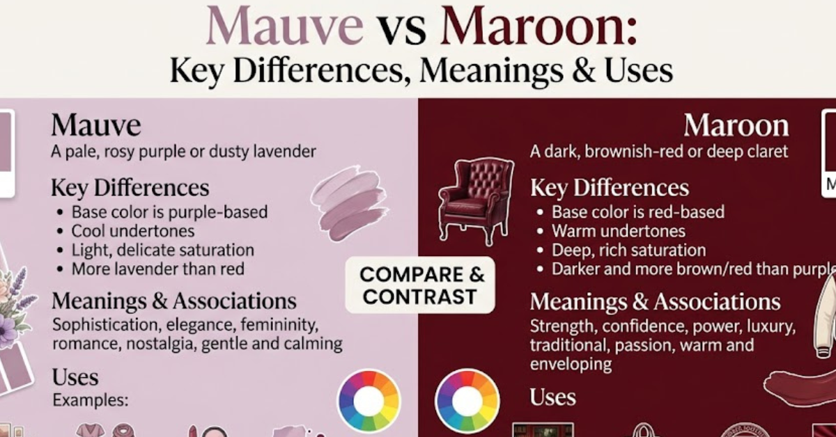
Mauve is a soft, muted shade of purple with subtle gray and pink undertones. It’s often described as elegant, romantic, and calming.
The name “mauve” comes from the French word for the mallow flower. Historically, it gained popularity after the accidental discovery of the first synthetic dye—mauveine—in 1856 by English chemist William Henry Perkin.
Characteristics of Mauve
- Light to medium purple tone
- Contains gray and pink undertones
- Soft, understated appearance
- Often associated with elegance and femininity
- Creates a calm and sophisticated atmosphere
Common Uses
- Wedding themes
- Bedroom décor
- Women’s fashion
- Floral arrangements
- Luxury product packaging
What Is Maroon?
Maroon is a deep, rich shade of red with brown undertones. It feels bold, mature, and luxurious while remaining more subdued than bright red.
The name originates from the French word marron, meaning chestnut, reflecting its earthy richness.
Characteristics of Maroon
- Dark red with brown undertones
- Warm and intense
- Rich, dramatic appearance
- Symbolizes confidence and strength
- Works well in traditional and modern designs
Common Uses
- Formal clothing
- Corporate branding
- University colors
- Autumn décor
- Furniture and accent walls
Mauve vs Maroon: Quick Comparison
| Feature | Mauve | Maroon |
| Color Family | Purple | Red |
| Undertones | Gray and Pink | Brown |
| Overall Feel | Soft and Romantic | Rich and Bold |
| Warm or Cool | Cool to Neutral | Warm |
| Best Seasons | Spring and Summer | Autumn and Winter |
| Popular Uses | Weddings, Bedrooms, Fashion | Formal Wear, Branding, Interiors |
| Emotional Effect | Calm and Elegant | Powerful and Sophisticated |
The Main Differences Between Mauve and Maroon
Although they may occasionally appear similar under certain lighting, these colors belong to different color families.
1. Color Composition
Mauve combines purple, gray, and pink.
Maroon combines deep red and brown.
This difference gives each color a completely unique personality.
2. Visual Appearance
Mauve appears softer, lighter, and more delicate.
Maroon appears darker, richer, and more dramatic.
In bright lighting, mauve can lean toward lavender, while maroon maintains its deep red character.
3. Emotional Impact
Colors influence how people feel.
Mauve often represents:
- Romance
- Creativity
- Peace
- Gentleness
- Grace
Maroon often symbolizes:
- Confidence
- Wealth
- Passion
- Stability
- Determination
4. Brightness
Mauve generally reflects more light and feels airy.
Maroon absorbs more light, creating depth and warmth.
5. Versatility
Mauve blends beautifully with soft neutrals and pastel palettes.
Maroon pairs well with earthy tones, metallics, and darker neutrals.
Mauve vs Maroon in Fashion
Fashion designers use both shades differently because they communicate different styles.
When to Wear Mauve
Mauve works especially well for:
- Spring weddings
- Bridesmaid dresses
- Business casual outfits
- Elegant evening wear
- Everyday feminine styles
Colors That Match Mauve
- White
- Cream
- Beige
- Sage green
- Silver
- Dusty rose
- Soft gray
When to Wear Maroon
Maroon creates a stronger visual statement.
It’s popular for:
- Formal suits
- Winter coats
- Evening gowns
- Leather accessories
- Office attire
Colors That Match Maroon
- Black
- Gold
- Camel
- Navy blue
- Forest green
- Ivory
- Charcoal gray
Mauve vs Maroon in Interior Design
Interior designers choose these shades based on the mood they want to create.
Decorating with Mauve
Mauve makes spaces feel:
- Relaxing
- Airy
- Modern
- Elegant
It works well in:
- Bedrooms
- Nurseries
- Bathrooms
- Reading rooms
- Living rooms with minimalist décor
Decorating with Maroon
Maroon creates:
- Warmth
- Luxury
- Depth
- Sophistication
It’s commonly used in:
- Dining rooms
- Libraries
- Home offices
- Accent walls
- Traditional living rooms
Which Color Is Better for Branding?
The answer depends entirely on your brand identity.
Mauve Works Best For
- Beauty brands
- Wellness businesses
- Fashion boutiques
- Wedding services
- Lifestyle products
It communicates softness, creativity, and elegance.
Maroon Works Best For
- Universities
- Law firms
- Luxury brands
- Restaurants
- Financial institutions
It conveys trust, prestige, authority, and confidence.
Color Psychology: How People Perceive These Shades
Understanding color psychology helps explain why businesses, designers, and artists carefully select these colors.
Mauve Psychology
People often associate mauve with:
- Compassion
- Imagination
- Serenity
- Sensitivity
- Sophistication
Because it’s muted rather than vibrant, it feels calming instead of overwhelming.
Maroon Psychology
Maroon typically evokes:
- Strength
- Courage
- Maturity
- Luxury
- Ambition
Its darker tone gives it a refined appearance that’s less aggressive than bright red.
Which Skin Tones Do They Complement?
Mauve Looks Great On
- Fair skin
- Neutral undertones
- Cool undertones
- Light olive complexions
Maroon Looks Great On
- Medium skin
- Deep skin tones
- Warm undertones
- Rich olive complexions
Of course, personal style matters just as much as color theory.
Popular Color Combinations
Best Pairings with Mauve
- Mauve + White
- Mauve + Sage Green
- Mauve + Champagne
- Mauve + Soft Gray
- Mauve + Blush Pink
Best Pairings with Maroon
- Maroon + Gold
- Maroon + Cream
- Maroon + Navy
- Maroon + Olive Green
- Maroon + Black
Can Mauve and Maroon Be Used Together?
Absolutely.
Although they’re different, they complement each other surprisingly well when balanced correctly.
For example:
- Maroon furniture with mauve cushions
- Mauve flowers alongside maroon ribbons
- Maroon blazer with a mauve blouse
- Wedding décor featuring both shades with gold accents
The contrast creates depth while maintaining an elegant appearance.
How to Choose Between Mauve and Maroon
If you’re still undecided, consider these questions.
Choose mauve if you want:
- A softer aesthetic
- Romantic styling
- Bright, airy spaces
- Modern elegance
- Gentle color palettes
Choose maroon if you want:
- Rich sophistication
- Bold fashion statements
- Warm interiors
- Classic luxury
- Strong visual contrast
Practical Tips for Using These Colors
- Test paint samples under natural and artificial lighting before committing.
- Pair mauve with light neutrals for a fresh, calming look.
- Use maroon as an accent color if you want depth without overwhelming a space.
- Consider the season—mauve suits spring and summer, while maroon shines in fall and winter.
- Balance either color with complementary textures like wood, linen, velvet, or metallic finishes for added visual interest.
Key Takeaways
- Mauve is a muted purple with gray and pink undertones.
- Maroon is a deep red with brown undertones.
- Mauve creates a soft, calming atmosphere.
- Maroon conveys richness, confidence, and warmth.
- Both colors work beautifully in fashion, interiors, and branding but suit different styles and moods.
- Choosing the right shade depends on your desired aesthetic, season, and overall color palette.
Frequently Asked Questions
Is mauve darker than maroon?
No. Maroon is generally much darker than mauve. Mauve is a lighter, muted purple, while maroon is a deep reddish-brown shade.
Can mauve and maroon be worn together?
Yes. Mauve and maroon create an elegant, layered color combination, especially when paired with neutral accessories like cream, beige, or gold.
Which color is warmer: mauve or maroon?
Maroon is the warmer color because it is based on red with brown undertones. Mauve leans cooler due to its purple and gray composition.
Is maroon considered a shade of red?
Yes. Maroon is a dark shade of red with noticeable brown undertones, making it richer and less vibrant than classic red.
What colors pair best with mauve?
Mauve pairs well with white, ivory, sage green, blush pink, silver, soft gray, and beige. These combinations create a refined and harmonious look.
Which is better for home décor: mauve or maroon?
Neither is universally better—it depends on the space. Mauve works well in calming areas like bedrooms and reading nooks, while maroon adds warmth and character to dining rooms, studies, and accent walls.
Conclusion
Understanding mauve vs maroon goes beyond recognizing two attractive colors—it helps you make smarter choices in fashion, home décor, branding, and creative projects. Mauve offers a soft, romantic elegance with its muted purple tones, while maroon delivers timeless richness through its deep red-brown character.
Whether you’re refreshing a wardrobe, choosing paint colors, designing a logo, or planning an event, selecting the right shade can significantly influence the overall mood and visual impact. Use the comparisons and practical tips in this guide to choose with confidence, and continue exploring color combinations to create spaces and styles that reflect your personal taste.